Feeling Blue? Colour therapy might be for you.
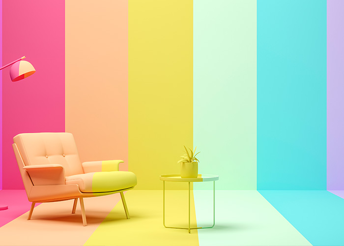
People are spending an increasing amount of time in their homes. It only makes sense, then, to make it as positive an experience as possible. One such way to maximise the joy you feel in your environment, is to utilize colours that elicit a certain emotional response. Most already do this on a subconscious level, gravitating towards the colours they like the most. However, there may be more to this colour selection than just preference. This is where colour therapy comes in.
How Colour Impact Your Mood
A great example of how the colour of a room can impact your mood can be found in the design aesthetic of beach side properties. When one arrives at the coast, and you walk into that full white room with fresh white linen, you instantly feel tranquil and refreshed. Go on, picture it… see what we mean. The thought of laying there, with the breeze blowing in through the balcony and the sound of the waves in the distance. An experience initiated by the calming colour palette of the room.
The use of colour is largely overlooked in everyday life, but it can have a profound impact.
Colour Therapy
Colour therapy as a practice has a significant amount of history within an array of ancient, and modern, cultures. It has been practiced in India for thousands of years. It played a notable role in Ancient Greece and in the Middle Ages.
Skipping ahead to the 17th century, Isaac Newton advanced the practice by creating the first colour wheel, showing how the three primary colours are derived from white light.
There have been a vast number of studies done throughout the years on just how each colour effects people and the many applications of these effects. One such area with this knowledge has been applied is in branding.
How Big Brands Use Colour
Your favourite brands didn’t just accidentally stumble onto the colours that they use, it would have been a comprehensive process with a particular goal in mind. They would need to decide on exactly how they want the consumer to perceive them and what characteristics and traits they want associated with the brand. They would then test which colour or combination of colours would evoke this response in the majority of their potential customer base, and thus the decision would be made. Leading us to right now, where some companies have done this so well that certain colours are synonymous with their brand worldwide.
On the other hand, when done poorly, the wrong colours can jeopardize a brands position in the market, forcing them to start from scratch.
In the same way that these colours can evoke these emotions in relation to a brand or product, so too can do this in our everyday lives.
How Colour Affects You
If someone is struggling to concentrate, there are certain colours that can assist with this. In contrast, if someone’s energy is low or they are lacking motivation, there are colours that can energize and invigorate them. There are many resources out there that provide suggestions of which colours to try for which desired outcome, and with some experimenting, the best option can be found. There is a general consensus on the effect that each colour has:
Red
Stimulating and energizing, red is often used to evoke feelings of excitement and passion. It may also stimulate the circulatory system and arouse the senses.
Orange
Known as the “social” colour, orange is said to stimulate creativity, productivity, and enthusiasm. It’s also associated with optimism and communication.
Yellow
This bright colour is often associated with joy, happiness, and energy. It’s believed to stimulate mental activity and generate muscle energy.
Green
Often used for its calming and soothing effects, green symbolizes nature and tranquillity. It’s believed to relieve stress and promote healing.
Blue
Associated with peace, calmness, and serenity, blue is used in therapy to reduce anxiety and lower heart rate and blood pressure.
Purple
This colour is often associated with spirituality, mystery, and transformation. It’s believed to calm the mind and nerves, and it’s often used in meditation practices.
Pink
Pink is often associated with love, kindness, and femininity. It’s used in colour therapy for its calming effect and is believed to defuse aggressive and neglectful behaviour.
White
White is associated with purity, cleanliness, and neutrality. In colour therapy, it’s often used to provide clarity and encourage purification of thoughts or actions.
Blue Light and Sleep
In recent years, much attention has been given to the impact of blue light on sleep, mood and overall well-being. On the opposite end of the spectrum, red light has been shown to provide significant health benefits. Once again, the simple difference in colour completely changes the outcome.


