We discover the colours Pantone has set aside for us in 2022. Although these are merely predictions, they offer insight into the colour processes for 2022 and what we will be seeing more of in the near future. Here is your Pantone colour forecast.
The Big Pantone Deal
Incorporating colour into your house is a proven mood lifter and what better way to celebrate a world that is waking up from a Covid-19 slumber, than by taking inspiration from the world’s leading colour creators at Pantone. Every year they release a colour forecast inspired by the aspirations and hopes for the coming year. These colours are then adopted by designers, creators and manufacturers and make their way into our homes, one way or another.
The 2022 Predictions
The Pantone colour forecast this year is vibrant, fresh and diverse hinting at a more grounded, natural colour theme. Gone are the dark and moody jewel tones of five years ago. 2022 will be all about light and upliftment.
High Energy
The blue tones, “Cascade” and “Super Sonic” evoke cleansing water, electric energy, and intense refreshing coolness without any harsh or garish brightness. These are the colours to use for gathering places, exercise spaces and as accent pieces in the kitchen. Best suited for Décor and Accents, these blues have nothing brooding or stormy about them. They are pure, unapologetic, and altogether invigorating.
Soft Tones
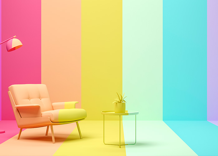
The pastel tones, “Popcorn”, “Potpourri”, and “Orchid bloom” are gentle, comforting reminders of a quieter time. Inviting you to take a step away from a frenzied world that is cloaked in the grey of uncertainty and indulge in a lulling haze of mellow mindfulness. Use these colours for bedding and loungewear – show yourself kindness after a tumultuous 18 months, by wrapping yourself in layer upon layer of yellow, pink and purple pastel nourishment. Best suited for textiles, or as an accent wall colour to calm the mind and create a sense of focussed safety.
Dust and Earth
The earth tones of “Sudan Brown”, “Coffee Quartz” and “Coral Rose” are the darkest colours of the forecast, but still by now means heavy or overwhelming. They simply evoke rich fertile soil – a place for the spirit to take root. A place from which infinite growth is possible. A place for rebirth. These energising tones are perfect for bedrooms, and workspaces, forming the unfaltering foundations of thought and self-actualisation. Fulfilment. Completion. Potential reached.
Pop Art
The final two colours Pantone colour forecast play a big role in all aspects of design for the year of 2022 are the contrasting “Bubble-gum” and “Fragile sprout”. A light-hearted true pink and an acidic, visually arresting yellowish-green, these colours, when paired with the other colours in the forecast allow for a great range of movement and flow. There is enough scope within these colour codes for any designer to be able to do unique and breath-taking work. These two colours are ideal for furniture and due to their retro inspirations, you should be on the lookout for thrifted or antique décor items that serendipitously reflect these colours.


