Colour of the Year 2021
Year after year Pantone’s Colour of the Year influences everything from home décor trends, to fashion and design. Pantone’s colour experts go through a meticulous process to choose colour trends for the year. Pantone describes the 2021 colour-inspiration palette as a step forward into a season of quieter, more natural colours that hint at the influence of raw dyestuffs and recycling. Unlike previous years, Pantone launched two colours to take the crown in 2021. Illuminating, a vibrant, well-timed yellow and Ultimate Grey are the colours of the year.
The Pantone Colour Institute’s, Leatrice Eiseman describes the combination of grey and yellow as “a message of positivity supported by fortitude,” adding, “this is a colour combination that gives us resilience and hope.”
Illuminating
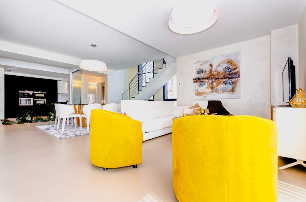
Pantone describes Illuminating as aspirational and a colour that gives us hope. We need to feel that everything is going to get brighter – this is essential to the human spirit. We could not agree more. This bright colour will give you endless joy in your home and office space. If you are using this colour, start with an accent wall and pick up the colour in décor elements like scatter cushions, mats or lampshades.
Ultimate Gray
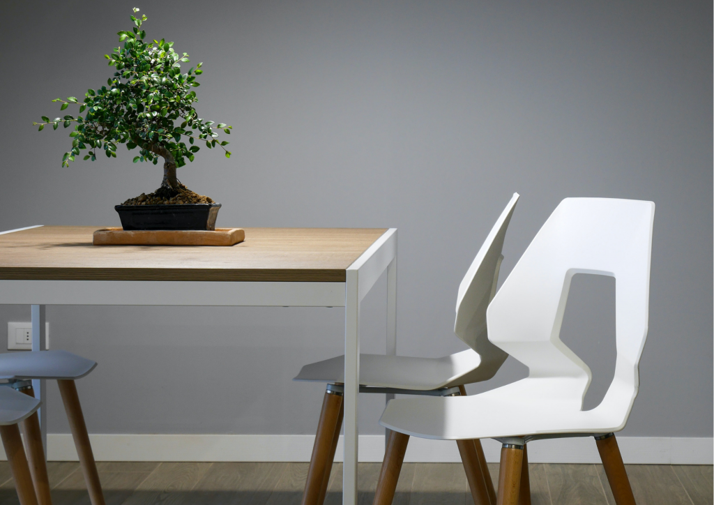
As we know, people are becoming more conscious of their living environment with the return to organic, natural materials. A colour inspired by the natural elements around us, Pantone says Ultimate Gray is emblematic of solid and dependable elements which are everlasting and provide a firm foundation. Ultimate Gray quietly assures encouraging feelings of composure, steadiness and resilience.
Pair this colour in a texture-rich space with ceramics, velvet, faux fur, glass and metal.
AI Aqua
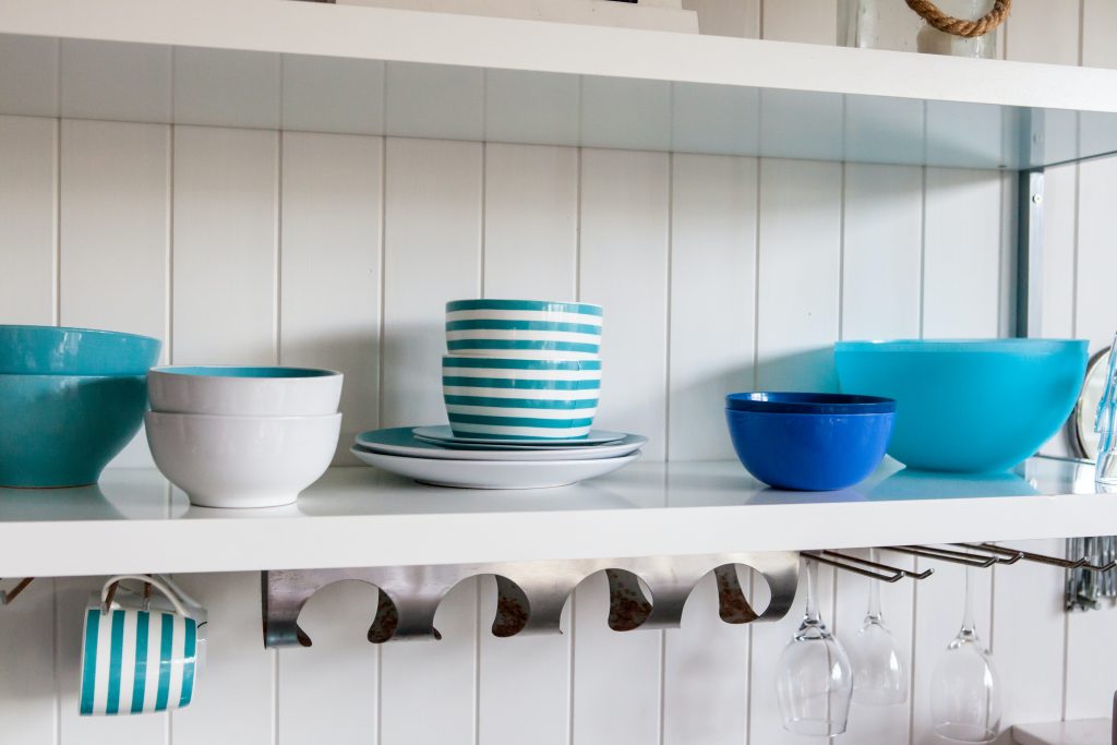
AI Aqua was a popular prediction for 2021’s colour of the year. The AI in AI Aqua is a clear indication that technology is the main inspiration behind this colour. According to Pantone, this blue is inspired by technology and elements that evoke a feeling for the future and inspire the world around us. In addition to offering a digital quality, this hue works with a wide variety of bright yellow shades, emerald type greens and of course bold black.
Raspberry Sorbet
A beautiful, bright pink with red undertones. Raspberry Sorbet is a welcoming colour and perfect for entryways and bedrooms. The colour works beautifully with both raw elements like wood and bamboo and with high-end materials like crystal. Pair the colour with shades of green to imitate the raspberry’s natural colour palette. Gold accents always compliment a pink-inspired colour.

Graham & Brown
Mint
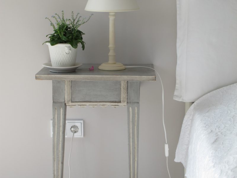
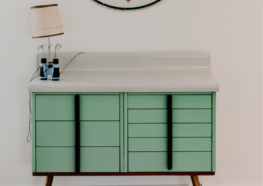
Mint is a muted green that evokes the feeling of eating ice cream on a hot summer day. It is a traditional and elegant tone of green that works well as a colour that you can take throughout your interiors. Mint is a subtle colour with a lot of range. From bathrooms and dining rooms to bedrooms and living rooms, the colour’s versatility is partly why it is a favourite for 2021.
By Marion Nowak

